


Purposeful Dashboards Part I: Design Modeling
This is the first in a series of three articles focused on building customer experience dashboards for business. This article focuses on design modeling, with article two focused on time continuums, and article three on geographic segmentation. Opportunities to Test Drive our customer experience dashboards will be provided in articles two and three.
Business dashboards are exceptional tools for visualizing data and allowing end-users to interact dynamically with key metrics. It’s a blend of science and art to create visually appealing and highly functional dashboards that are easy to navigate and on-purpose. Dashboards should provide key information about the business that is easily understood and navigable, as well as, create opportunities for company growth and business enhancements.
Design modeling of a business dashboard should be similar to that of an automobile dashboard. Automobile dashboards are comprised of four Key Performance Indicators (KPI’s): speedometer, tachometer, fuel gauge, and temperature gauge. Additionally, they are symmetrical using similar shapes and colors. Easy to read; easy to understand. Business dashboards should be no different.
There should be three to five KPI’s included on a single dashboard. Keep in mind the purpose of a dashboard is to provide information and data that monitors the health and performance of the business. Just like an automobile dashboard monitors and measures the speed of the car—speedometer and revolutions per minute (RPM) of the drive shaft—tachometer, so to a business dashboard should measure important KPI’s of the company including customer experience.
Information Overload
Ever seen a dashboard that included everything under the sun? The problem with these types of dashboards is that by including everything we are focused on nothing. Our brain is overwhelmed by the amount of information and the mix of visualizations being displayed. In this dashboard example, we have a mix of many different graphical types including radial dials, doughnut and pie charts, bar and line graphs, maps, area and scatter plots, and numerical counts.
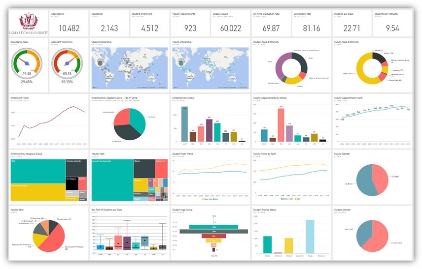
It’s impossible to understand the KPI’s from this dashboard and whether their current status is good or bad. The dashboard is displaying too much information using too many different visualizations. And while it’s certainly advisable to use different types of charts and graphs in a business dashboard depending on how the KPI’s are measured, just not so many as to create confusion and frustration.
Strenuous Color Schematics
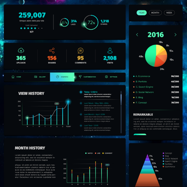
Some dashboards get the KPI’s right but get the color schemes wrong. Difficult color schemes limit one’s ability to comprehend the information being displayed. Dark or black backgrounds can certainly be used but the visualizations and associated text needs to be in contrasting colors to make it easy to read and comprehend. In this example, some of the graphs and charts have enough contrast to make them readable but not all of them. Most of the associated narrative is in colors that are impossible to read even when blown up to 400% of the normal size.
Dark visualizations and text layered over dark backgrounds are not advisable as they may require ‘Night Vision Goggles’ to read. Similarly, bright pastel colors on light backgrounds are not advisable either as they may require ‘Sun Glasses’ to read.
Keep it simple and easy on the eyes when using color schemes.
Design Modeling
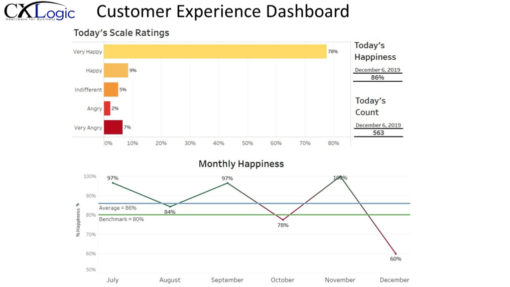
In our example of a customer experience dashboard I focus on a single item using an automobile dashboard as our design model combined with a simple, yet meaningful, color scheme. Our KPI is, How was your customer experience today? From this single KPI I created the following four metrics—count of survey respondents, percentage of respondents categorized as ‘Happy’ or ‘Very Happy’, percentage of respondents in each scale category, and percentage of respondents categorized as ‘Happy’ or ‘Very Happy’ over time measured in months.
Think of the metrics in our customer experience dashboard in an analogous manner to an automobile dashboard. Today’s Happiness is the cumulative percentage of respondents identified as ‘Happy’ or ‘Very Happy’. It’s the temperature of the company’s customer experience—temperature gauge. Today’s Count is the cumulative count of the number of survey respondents. Think of this as the fuel gauge, count of customers interacting with the feedback system. Today’s Scale Ratings is the cumulative percentage of respondents falling within each scale category. View this as the tachometer, rate at which the percentages are changing across categories. And last, Monthly Happiness is the percentage of respondents identified as ‘Happy’ or ‘Very Happy’ segmented by month. It’s the speedometer of the company representing the speed at which customer happiness is changing over time.
It’s not necessary to link each KPI in a business dashboard to an automobile dashboard like I did in this article. I did this for illustrative purposes on design modeling of business dashboards that are on-point and purposeful. Dashboarding with purpose is all about creating visually appealing business dashboards that are highly functional, interactively dynamic, and easy to navigate.
Several years ago, I was working with a community college Concurrent Enrollment (CE) department—students taking college courses while in high school. The department contacted me several times each week asking for data. It was a time-consuming process for submitting and fulfilling the department’s data requests. What they needed was a set of business dashboards where CE department staff could access and interact with data and information in ways they could understand and use to drive decision-making. After several discussions with department staff, I created a series of dashboards that provided the necessary information. The CE department staff became consumers of data and information and no longer needed my assistance. I never heard from them again.
That’s powerful. That’s Heartware for Business!