


In my previous article, Purposeful Dashboards Part I, I discussed using an automobile dashboard as a design model for building a highly functional and dynamic customer experience dashboard. This article discusses customer experience data across time continuums and how to incorporate variance in ratings into a business dashboard that is meaningful and impactful.
This is extremely important and highly effective for identifying points in time when customer experience ratings are not meeting defined benchmarks.
I will demonstrate the key elements of this dashboard with text and graphs throughout the article. And at the end of the article you will have an opportunity to take our customer experience dashboard for a Free Test Drive!
It’s important to understand that variance in customer experience ratings exists. Good or Bad; Right or Wrong; variation is a function of different people rating similar experiences, products, and services. Everything can be the same—same employees, same atmosphere, same products, same service quality; identical in every way. With one exception of course, the customers are not the same, they are different. And they have different perceptions, different expectations, different backgrounds, and different experiences. In reality, employees are different, atmospheres change, service quality ebbs and flows, and products look, feel, and function better on some days compared to others. Thus, there are a lot of factors impacting customer experience at any given point-in-time.
We can’t understand variance in customer experience ratings unless we can visualize it on a time continuum. Then, and only then, can we take steps to minimize the variability in ratings.
Let’s use the following item as an example, How was your CXLogic customer experience today? Customers are asked to rate their experience on a five-point scale from Very Happy to Very Angry. Our dashboard is similar to the one used in the previous article; however, we want to focus on the line graph at the bottom of the dashboard. This represents the percentage of customers who are Very Happy or Happy with their customer experience at CXLogic over time (e.g., months).
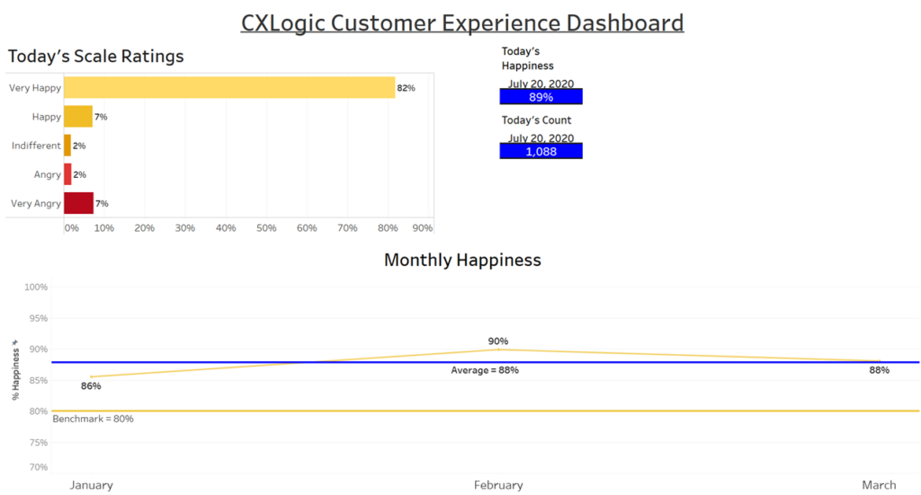
We set the benchmark for happiness at 80% and have calculated monthly happiness for January, February, and March, as well as, the three-month average. We can see that the percentage of customers who are happy with their customer experience at CXLogic has exceeded the benchmark over all three months ranging from a low of 86% in January to a high of 90% in February with a three-month average of 88%. Our customer experience is good!
Well, at least it looks good at the aggregate level of month. What about weekly, daily or hourly? This is where drill-through functionality pays dividends.
By clicking on the data point for February—90%, the resulting action drills through to a secondary dashboard that displays ‘Weekly Happiness’. And it’s only for those weeks in the month of February—weeks 6 through 9. Again, we can see that our happiness rating is above our benchmark of 80% for all four weeks in February. Additionally, the weighted average is only for those customers who completed the survey question during the month of February.
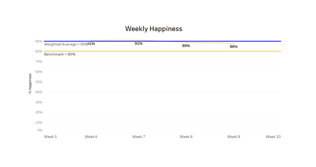
We see a slight downward trend in happiness from week 6 to week 9, so let’s investigate. Clicking on the data point for week 9—88%, triggers a drill-through action to a third layer dashboard displaying ‘Daily Happiness’ for the week that was selected (e.g. week 9).
The trend line is conditionally formatted for two colors only. When the line meets or exceeds the benchmark value of 80% its yellow and when it’s below the benchmark value the line is red. This is extremely useful for quick analysis of the data and for making drill-through decisions.
The weighted average is based only upon those respondents who completed the customer experience item during the selected week (e.g. week 9).
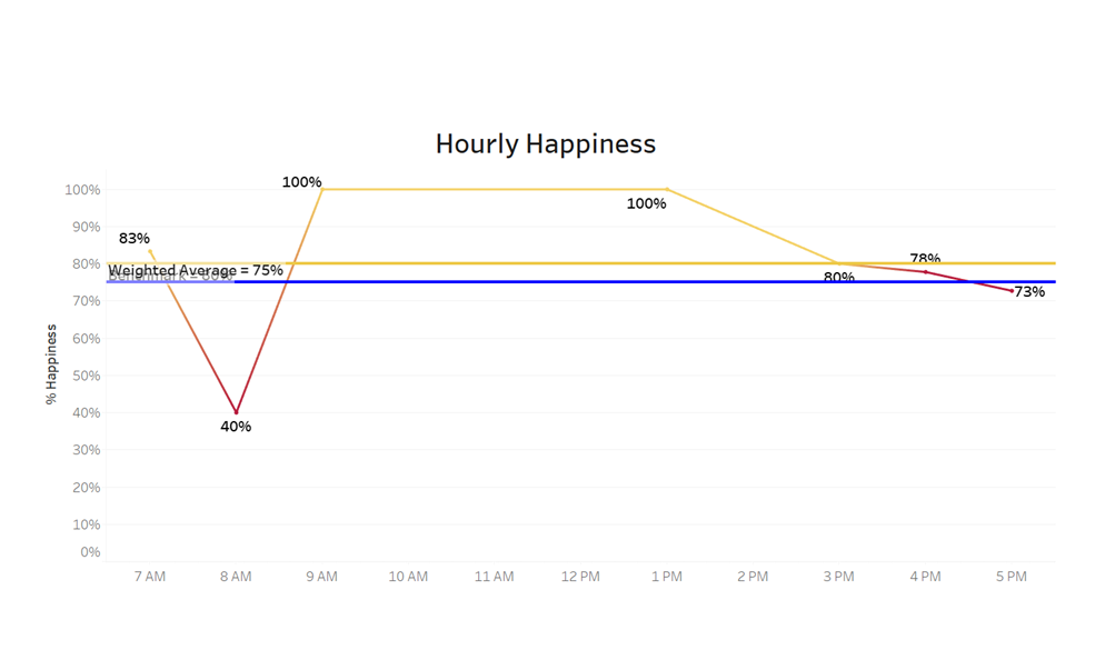
A quick look at the dashboard shows that customer experience was rated above the benchmark for four of the five days with the exception of February 27 when it was 75%. What to do now? Simply click on the data point for February 27—75% which will trigger another drill-through action to a fourth layer dashboard that displays customer ‘Hourly Happiness’ for the day selected (e.g., February 27).
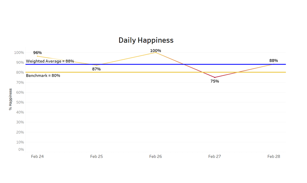
Since our business is open Monday through Friday, we only show those five days of the work week. For businesses that are open on Saturday’s and/or Sundays, the dashboard would display six or seven days of the work week.
This dashboard shows the customer experience ratings each hour for the day that we selected—February 27. We can see that for most of the day our ratings were above the pre-defined benchmark of 80% with the exceptions of 8:00AM, 4:00PM, and 5:00PM.
What happened at those times? We had a rush of customers at opening and closing times and not enough staff to assist them. Thus, customer wait times were longer than normal which adversely affected our customer experience ratings.
I hope the importance of dashboarding across time continuum has become clear. This is the most effective way to monitor customer experience over time. Drill-through dashboards are exceptionally effective for analyzing customer feedback data from the most aggregate level of year to the granular level of hour. Once those customer service gaps are identified corrective action can be taken to minimize the negative impact and enhance the customer experience.
Additionally, drill-through dashboards are ideally suited for assessing employee performance. Linking Human Resources data with customer feedback data can easily show which employees are meeting the benchmarks on customer experience.
Video demo of the CXLogic Customer Experience Dashboard:
Test drive the CXLogic Customer Experience Dashboard: FREE TEST DRIVE
I was working with a government organization that indicated one of their departments was experiencing a high number of complaints and nobody was happy with the department. At least anecdotally nobody was happy. I set up a Customer Feedback System (CFS) and collected data on a single item, How was your customer experience today? After five months of data collection and over 2,000 responses, the results showed a 93% aggregated ‘Happiness’ rating with only 4% categorized as ‘Angry’ or ‘Very Angry’. Interestingly, drilling through the data showed significantly lower levels of happiness in the afternoon three days per week. One of the employees on the afternoon shift on those days had a Baditude (aka: Bad Attitude). With some additional training and mentoring, that issue was easily corrected.
That’s Dynamic! That’s Heartware for Business!