Previously I discussed the importance of having a customer experience dashboard on a time continuum to understand variability in ratings across time (see article entitled, Purposeful Dashboards Part II: Time Continuum).
In this article I focus on incorporating geographic segmentation into a customer experience dashboard. What does this mean? Visualizing customer experience ratings across geographic locations.
This is ideal for businesses that have multiple locations such as stores, airports, entertainment centers and so on. These locations can be local—within a single city or state, national—across multiple states and cities, or international—spanning multiple continents and countries.
I’m sure you’ve guessed where I’m going. Just like our visualization of customer experience ratings across time moving from aggregate to granular levels of time so too we can visualize ratings from aggregate to granular levels of geography. And we can do so using the same type of drill-through functionality as demonstrated in the time continuum article.
Additionally, we can segment ratings across multiple devices within a single location. As an example, imagine an airport that has a customer feedback system in five different locations: baggage claim, check-in counter, duty-free shop, departure gate, and customer service counter. CXLogic provides the aggregate level of happiness for the airport as a single entity, as well as, the granular levels of airport happiness through multiple entities (e.g, business units).
Let’s look at an applicable example of how this works.
Again, I’m going to use a single item question, How was your Acme Corporation customer experience today? Keep in mind that Acme Corporation (AC) is a fictional company associated with the Road Runner cartoon series in the 1970’s. I’m going to use 70% customer happiness as our benchmark rating because AC’s products never seemed to work as advertised, at least not for Wile E. Coyote.
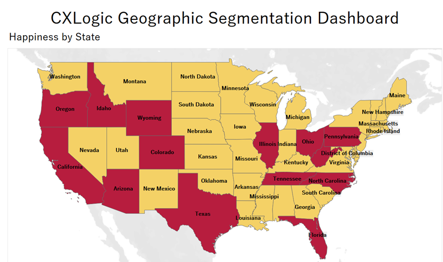
Customers rate their experience with the Acme Corporation on a five-point scale from Very Happy to Very Angry. Let’s assume that AC is located in multiple cities in every state in the continental U.S. excluding Alaska and Hawaii. Thus, our most aggregate level of visualization will be at the state level.

Our map of the continental United States shows that each state is conditionally formatted as either yellow or red. This is based on our defined benchmark of 70% happiness rating aggregated to the state level. Put another way, the state color is dependent upon the cumulative total of ‘Happiness’ for all customer feedback systems used in that state. Red states indicate that the ‘Happiness’ rating at the state level is below the defined benchmark of 70% whereas yellow states indicate the state level of ‘Happiness’ is at or above 70%.
This is an extremely efficient method for quickly identifying which states are meeting or exceeding the defined benchmark and which ones are not. And while this is the level of happiness state-wide, it doesn’t mean all locations in the state are meeting or exceeding the benchmark of 70%.
This is where drill-through functionality pays dividends again.
We can see that Washington is a yellow state meaning it has a happiness rating at or above 70%. Clicking on the state of Washington will drill-through to a secondary dashboard of individual cities within the state that have at least one customer feedback system in use.
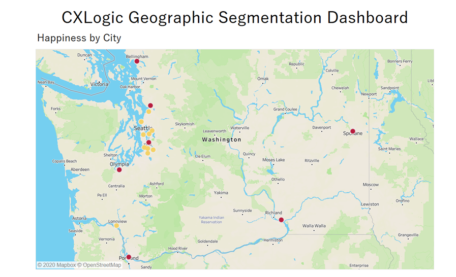
This secondary dashboard uses the same conditional formatting as that at the state level. Cities with a red dot indicate a city-level happiness rating below 70% while those with a yellow dot indicate happiness at or above 70%.
We can easily distinguish which parts of the state are meeting the defined benchmark for customer experience. All cities clustered around Seattle, with the exception of Renton, are meeting or exceeding the benchmark of 70%. Cities in Southern, Central, and Eastern Washington in general including Spokane, Richland, and Vancouver specifically are not meeting the benchmark for customer experience.

Recall, that Acme Corporation is located in multiple cities in every state in the continental U.S. We can see this in the Happiness by City dashboard whereby AC is located in multiple cities throughout the state of Washington. And each of those cities has a rating of customer happiness aggregated at the city-level.
And while Washington is a yellow state with a state-level happiness rating of 74%, not every city in the state is yellow. In fact, 7 of the 17 cities are red indicating they are not meeting the benchmark of 70% customer happiness.
What if Acme Corporation has multiple store locations located within a single city? If that’s true, then there is an additional layer of segmentation that we can drill-through to—store location.
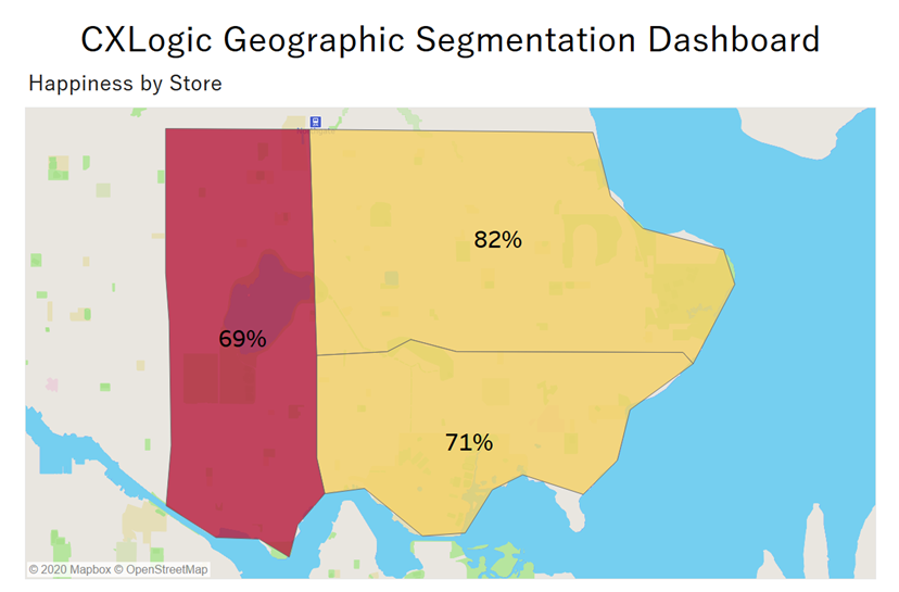
Clicking on the yellow dot for Seattle drills-through to a store-level dashboard. Each store is identified with a unique StoreID that includes the zip code of its location.
Looking at this dashboard we can see that two of the three Acme Corporation stores are yellow indicating they are meeting the customer experience benchmark for happiness at 70% or higher. The third store is red which means they are not meeting the defined benchmark, but they are really close at 69%.

This dashboard, happiness rating by store, is our most granular level of geographic segmentation used in this article as it illustrates the level of customer happiness by each store located in a single city. This is based on the assumption that a single customer feedback system is used within each store.
As indicated earlier, there can be another layer of geographic segmentation where multiple devices are used in a single store. Thus, a more granular layer may exist by different locations within a single store which could include checkout, fitting rooms, make-up counter, and so on.
Click the following link to test drive the CXLogic Geographic Segmentation Dashboard: FREE TEST DRIVE
CXLogic’s Customer Feedback Systems (CFS) include geographic segmentation reporting. Our dashboards include the functionality to drill-through from the most aggregate levels of geographic location such as continent, country, or state to the most granular levels possible including city, neighborhood, store, and kiosk. This is critical for understanding variations in customer experience ratings across geography.
This pays incredible dividends for comparative benchmarking.
I was flying China Eastern Airlines to Thailand on business in 2019 and had a scheduled 8-hour layover in Guangzhou Baiyun Airport in China. That flight was to take me to Bangkok for another layover before flying onto my final destination at Chiang Mai. Upon arrival at Guangzhou Baiyun Airport a China Eastern Airline representative asked me if I would like to change my flight itinerary at no cost and board a direct flight from Guangzhou Baiyun to Chiang Mai; and it was leaving in 10 minutes. I said YES! She saved me about 12 hours of time in flights and lay-overs. I was ‘Very Happy’. Upon completion of the flight change, she asked me if I would write a note to her supervisor about my customer experience. I was happy to do so.
How much more impactful would it have been to have selected a rating on a customer experience question using a Tablet/Kiosk and then opted-in for an additional survey that I could complete on my phone while boarding the flight? Customer feedback based on in-the-moment experiences.
That’s Impactful! That’s Heartware for Business!
Jon Proctor, CEO for CXLogic, is a Data Scientist/Statistician with a Ph.D. in Statistics from the University of Nebraska. He designs, builds, and deploys customer feedback systems and interactive analytics for business and government clients.
www.cx-logic.com
jon@cx-logic.com


